We were ready to start putting ideas into the designs once we gathered all the information and expectations from the growth team.
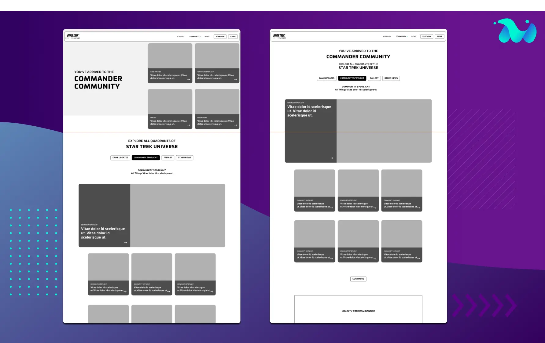
The first step was the development of wireframes for the website. Our designer created more than one option of UX to give Scopely a general feeling of their options. The whole project was built in Figma so that the client could share the process with or consult at any moment.
This first round allowed us to collect feedback to refine the wireframes interactively, making the best possible balance between the client's needs and design best practices, coming up with an adequate solution for this website.

Next on the agenda was setting a visual language for the website. Even though it was important that the website reflect the game itself, Scopely was looking for a modern design based on the actual game. We proposed to work on a decoupled UI that wasn’t completely dependent on the game, so the website will not get completely deprecated if there’s a change in UI.
Addressing this was a very interesting challenge while working on the Design System. Include something from the gaming world and adapt it to the website with different needs and rules.
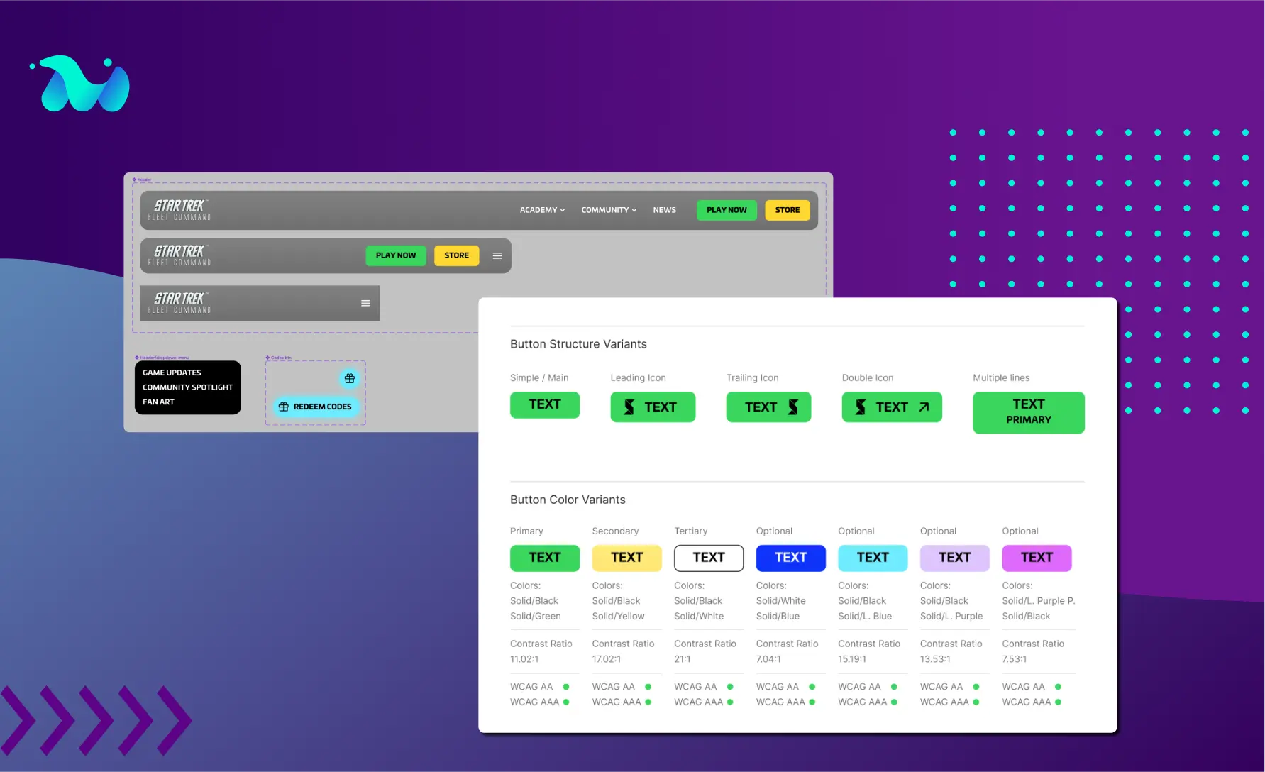
One of our main concerns was related to user accessibility for the website. For instance, some of the game’s original colours were tweaked to be in conformity with WCAG's AA and/or AAA level compliances. We had to follow with a series of colour testing and interactions with the Scopely team until we got to a well-balanced colour schema.

In general, the Design System we delivered was a compromise between best practices, STFC identity and a renewed vision of it. Using Figma was crucial during this iteration phase since it allowed for quick updates and changes at any given moment.
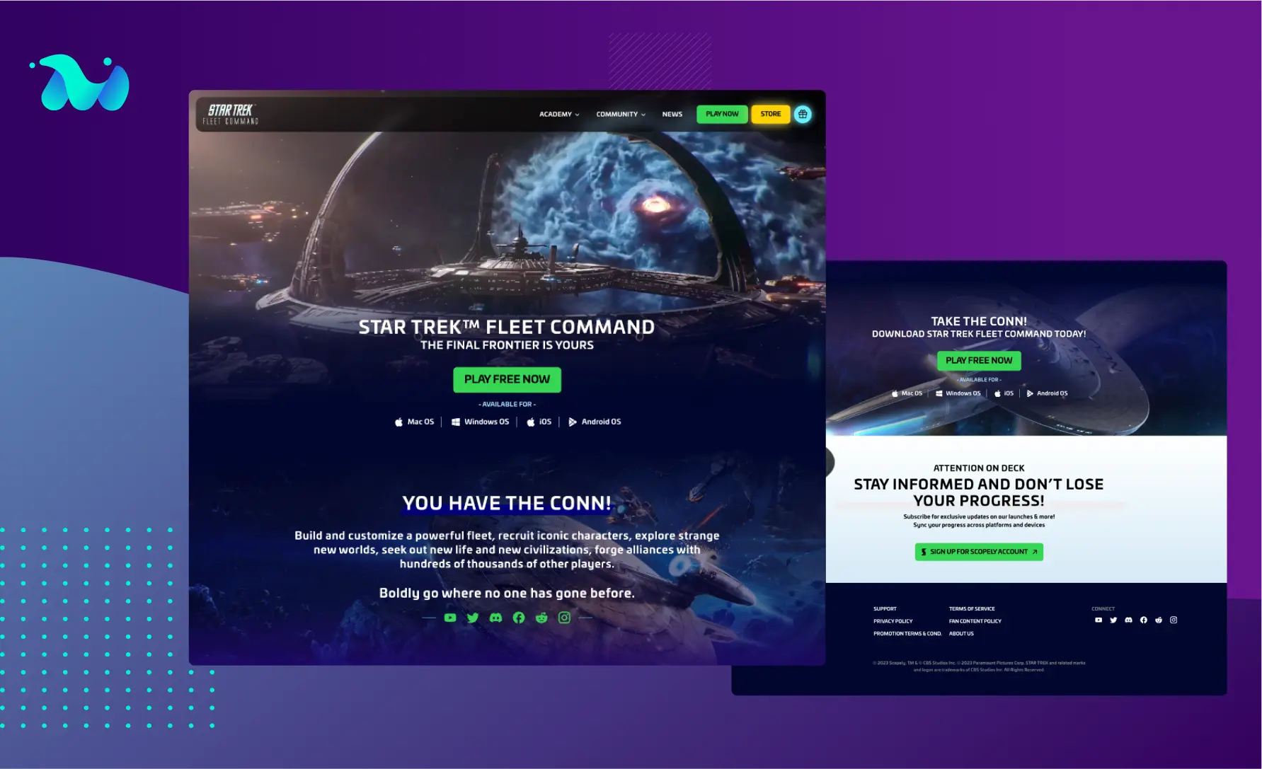
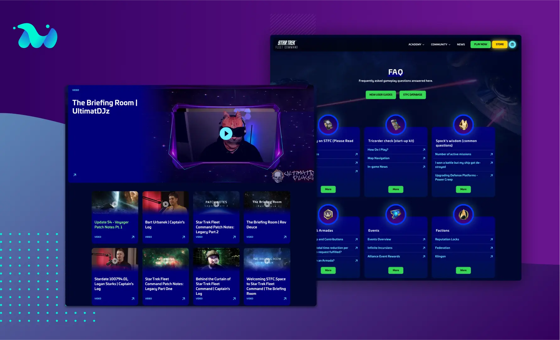
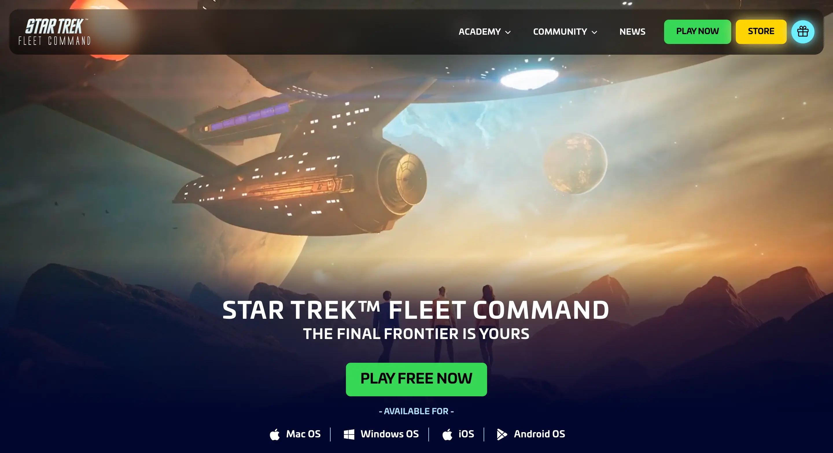
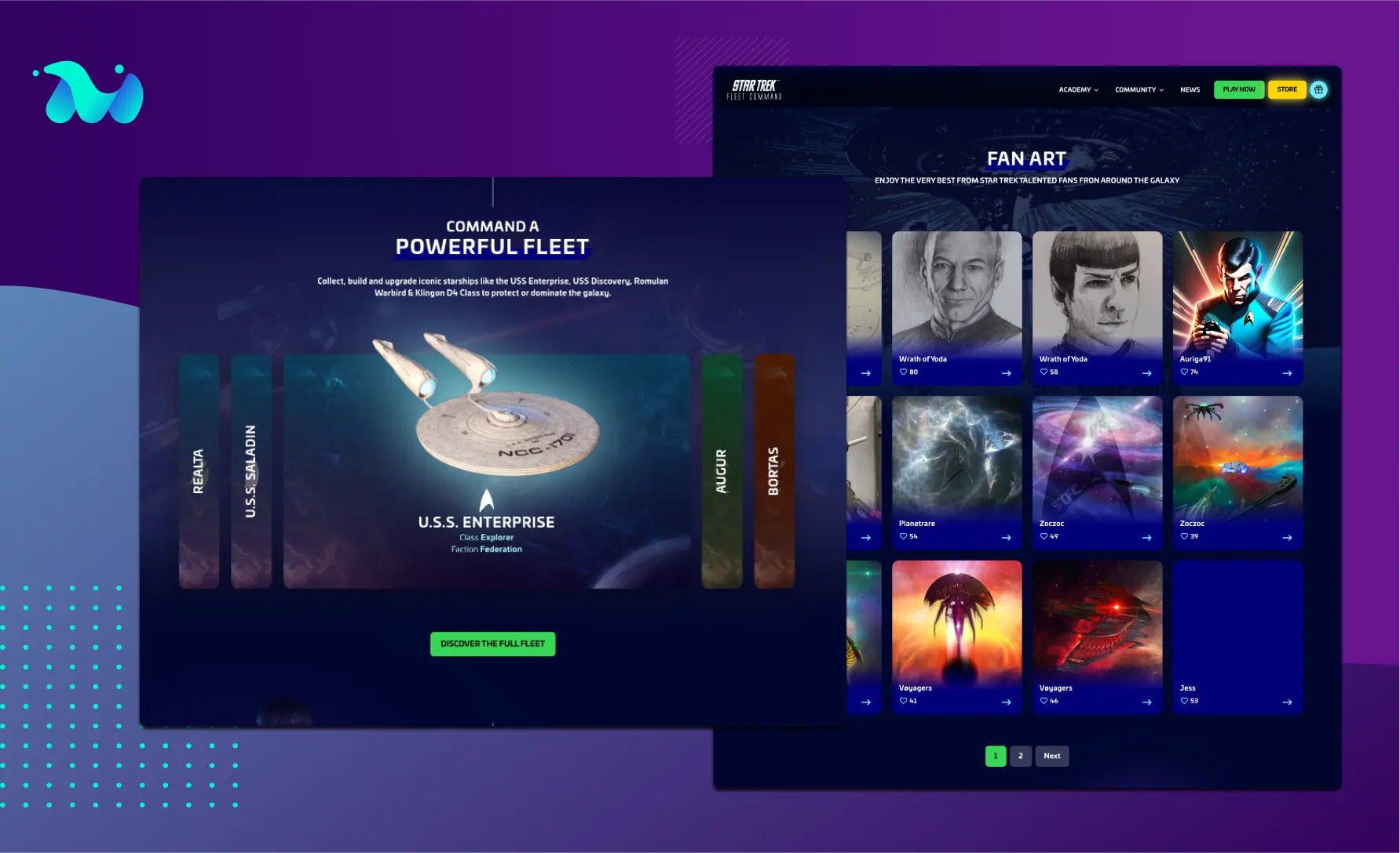
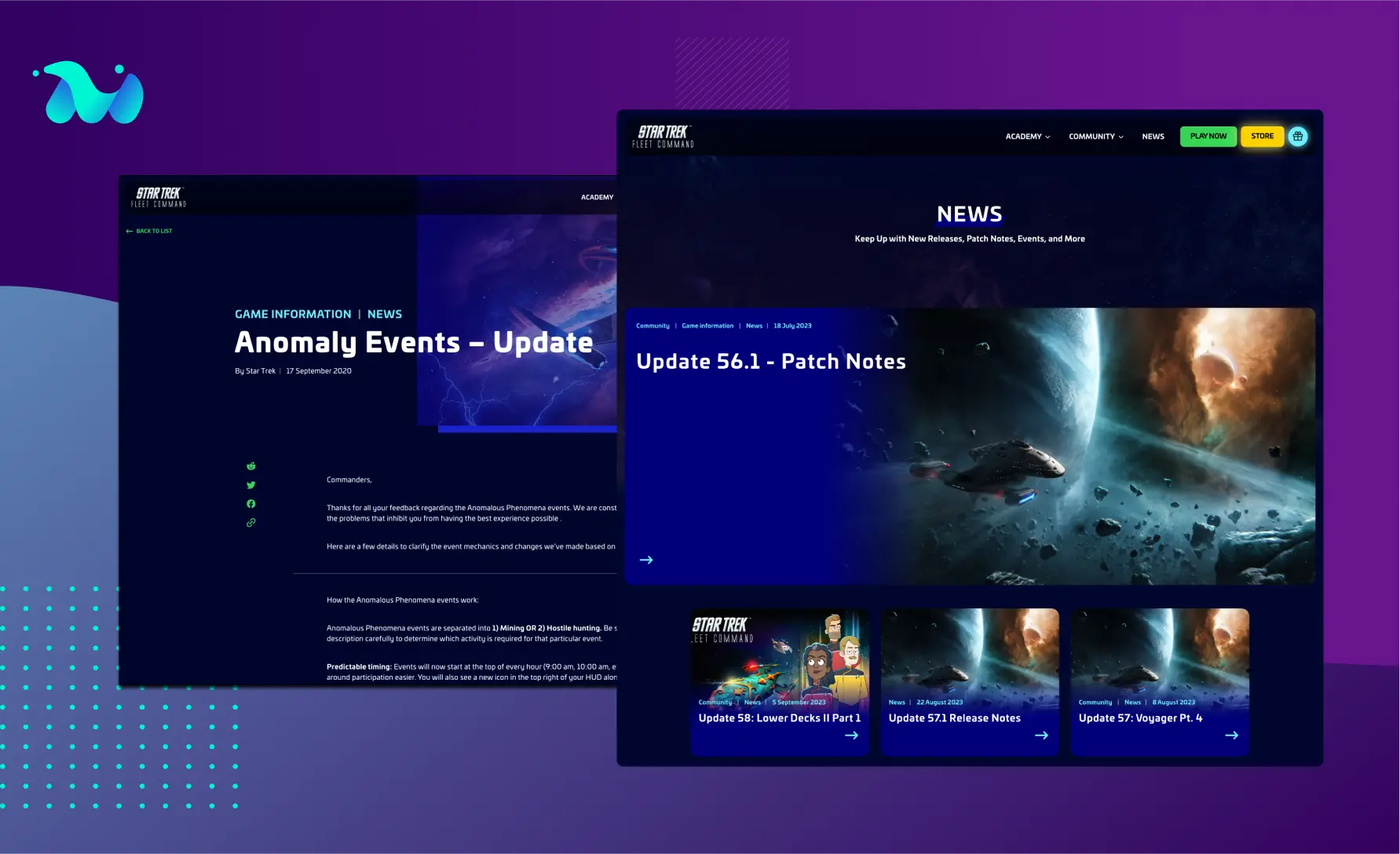
After the Design System was established and approved, we moved to the Hi Fidelity Mockups, bringing the insight from the wireframes and the UI system into formal layouts.

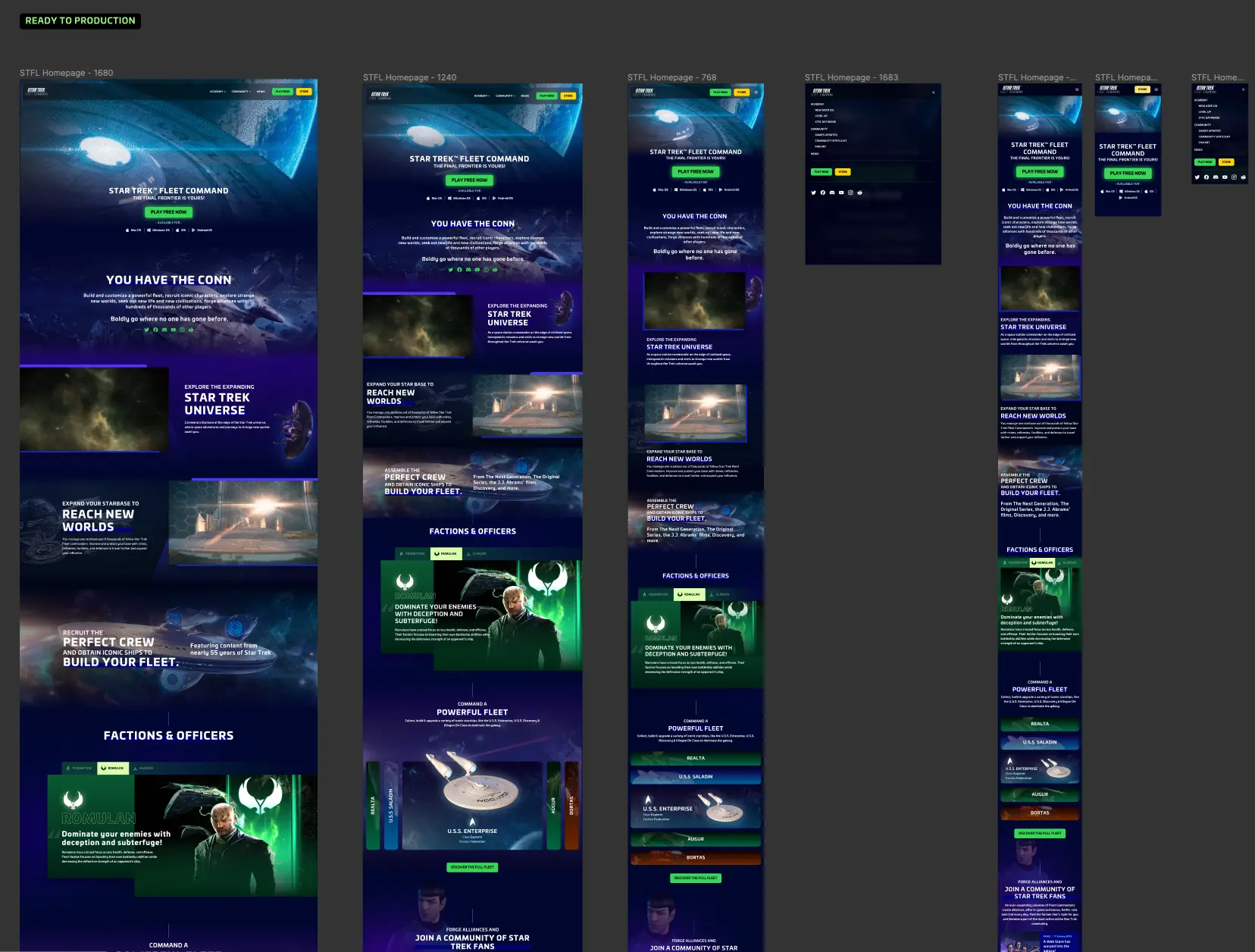
Each page was designed in several viewport sizes and immediately subjected to Scopely approval. Just like the wireframe stage, each milestone was reviewed.
In this phase, new people from the STFC team were brought in, which deepened the feedback and allowed for better conclusions.
Having the whole website designed, and by whole, we mean the templates for each type of content (homepage, article page, fan art page, etc.), it was now the moment to transition to the development stage.
