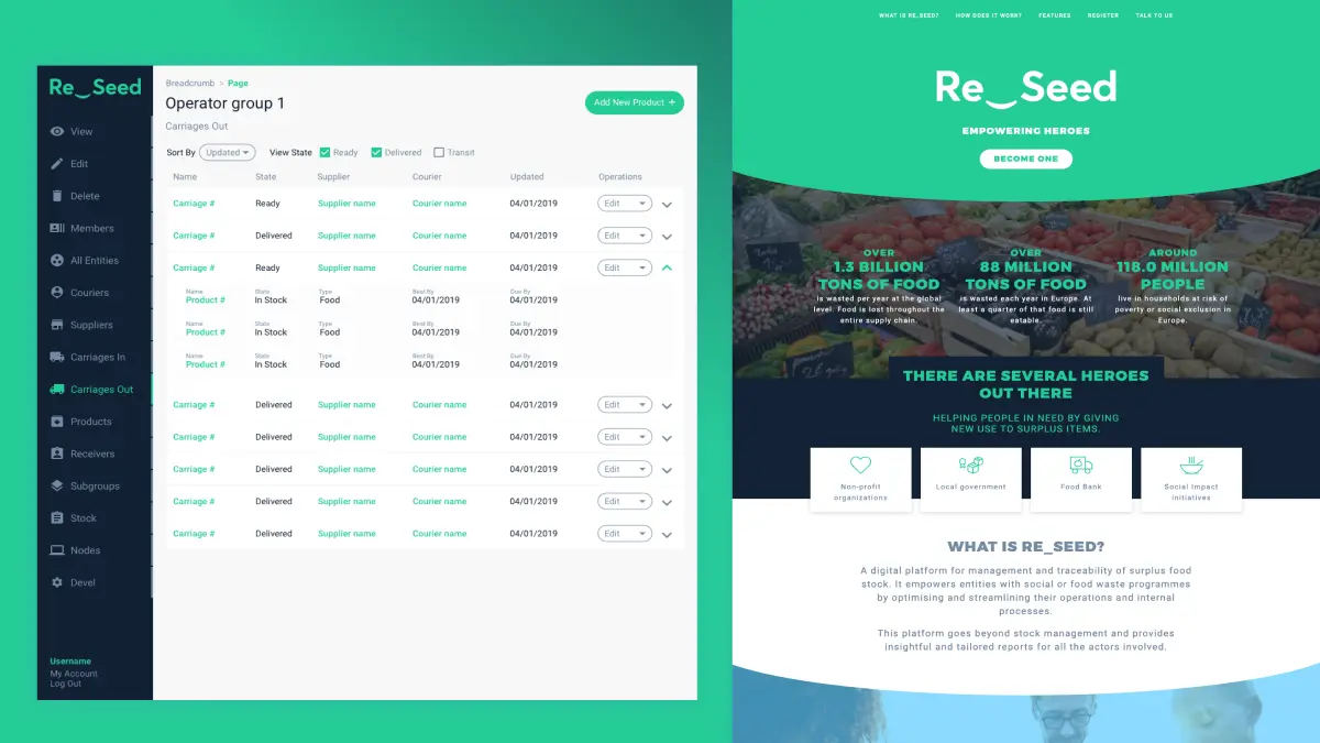
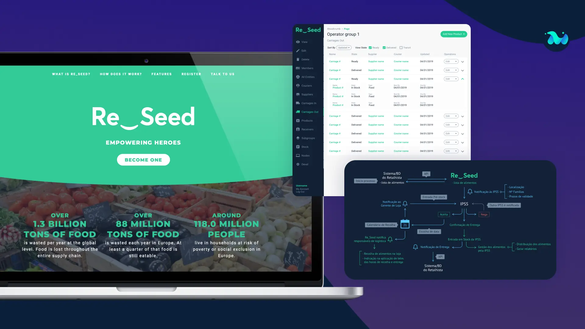
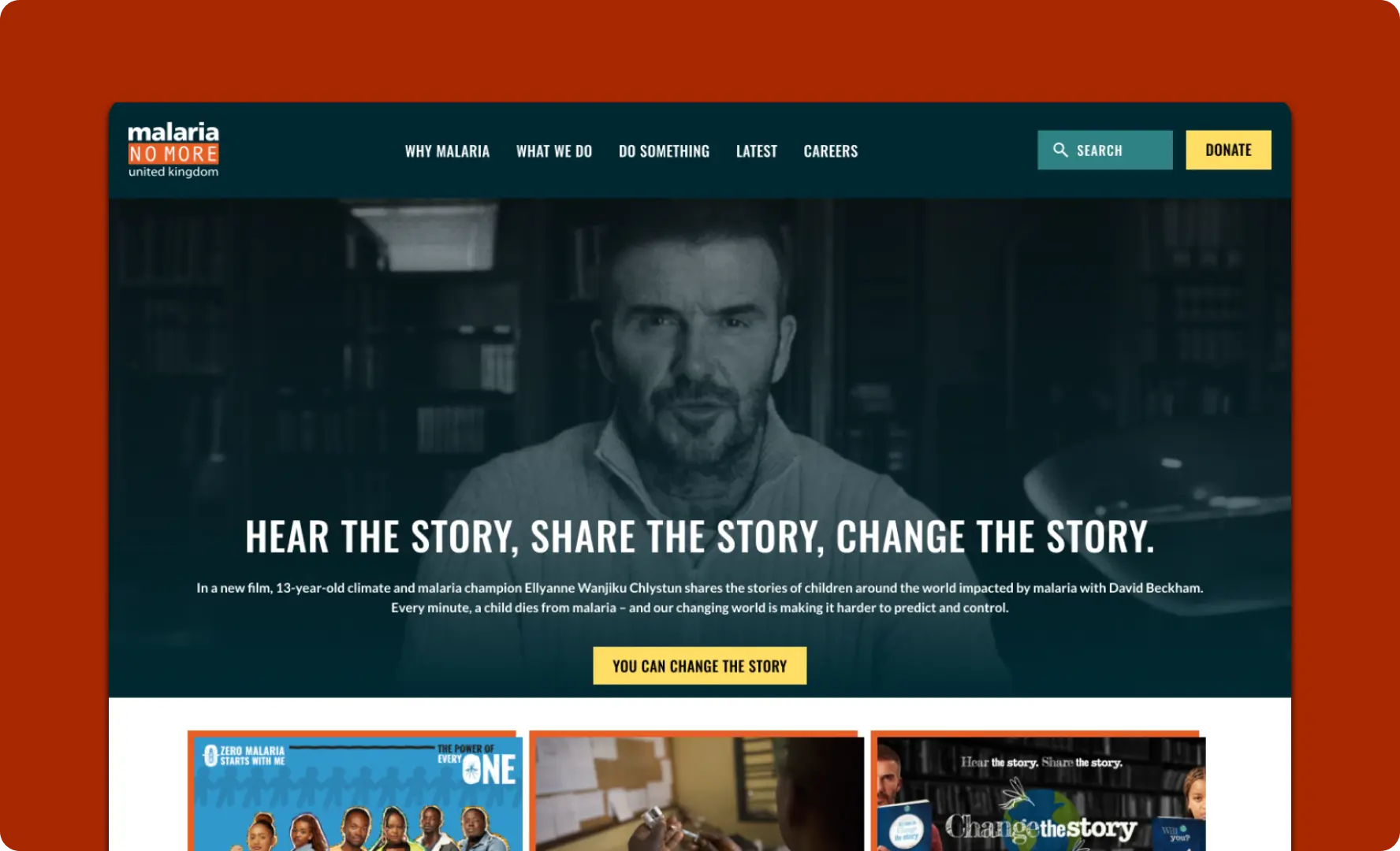
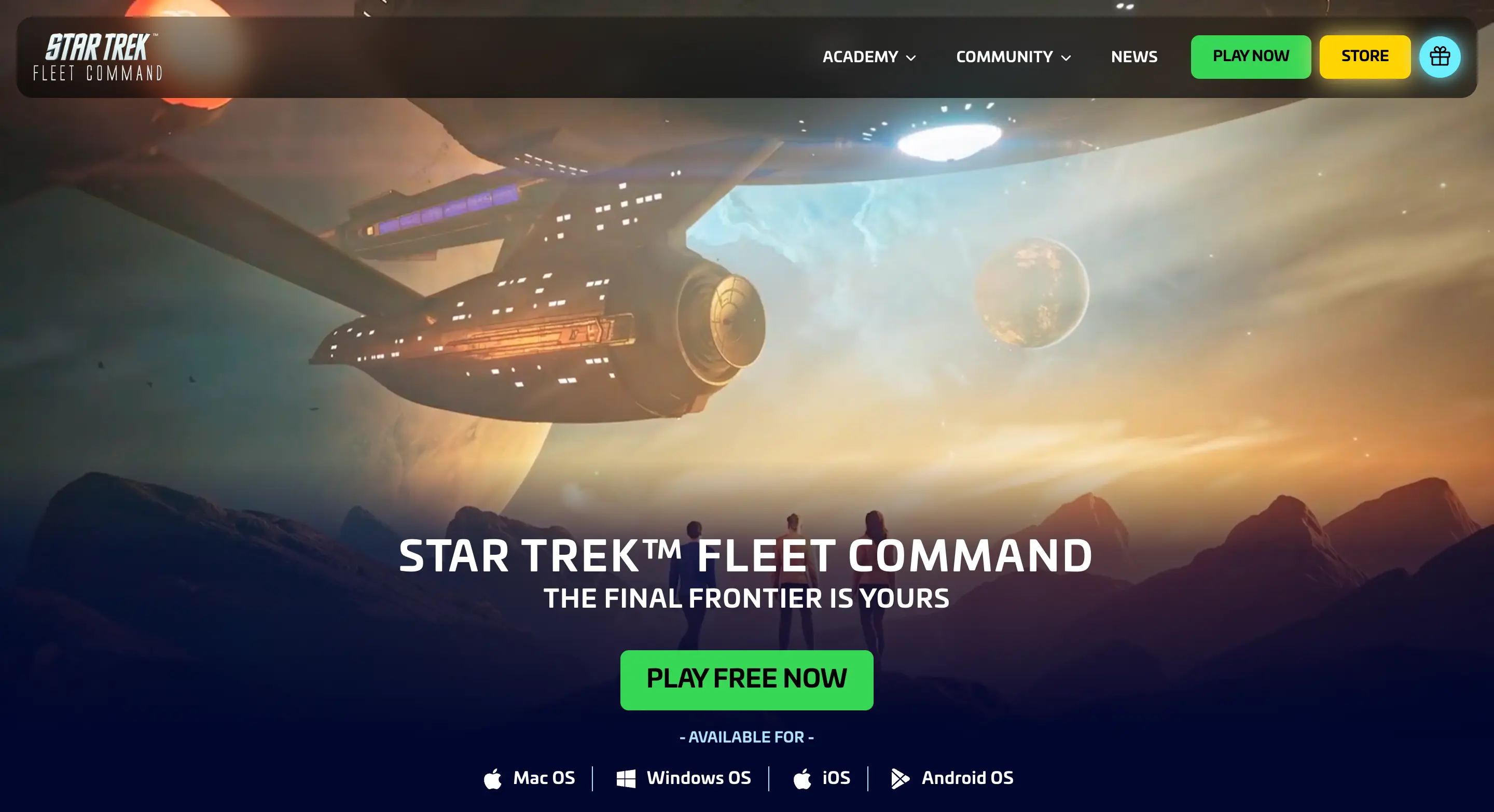
The web design and iconography for the platform followed the brand guidelines. We decided to develop mockups for both the institutional website and the platform itself.
For the institutional website, we first worked on a document with the text structure for the site and then worked on the mockup. The colours, typography, images and icons followed the brand book and the product message we wanted to pass. For the platform itself, the design process followed a differently structured line of work due to its complexity.
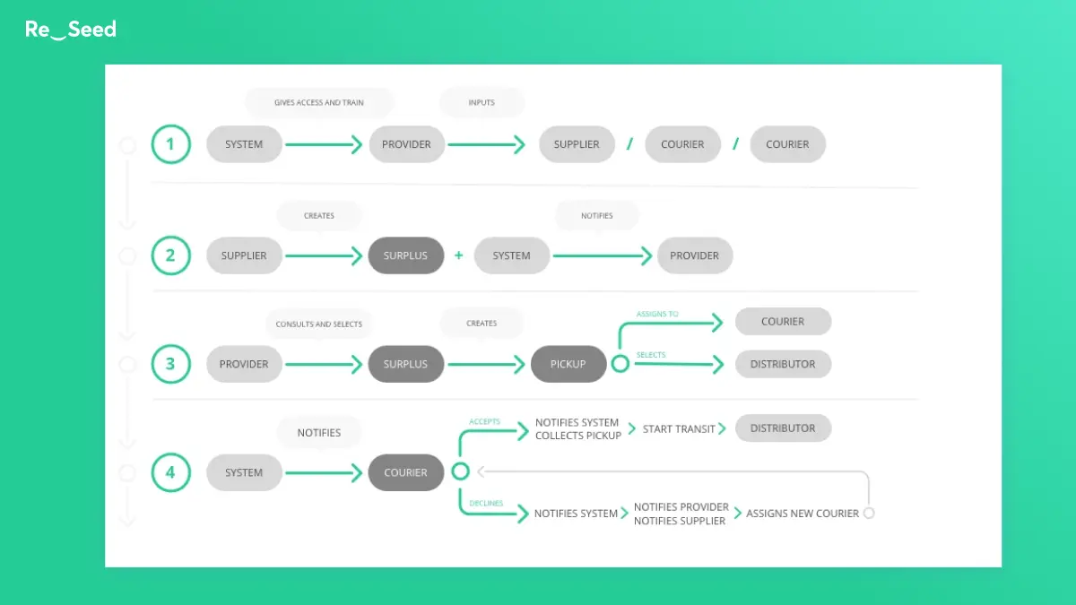
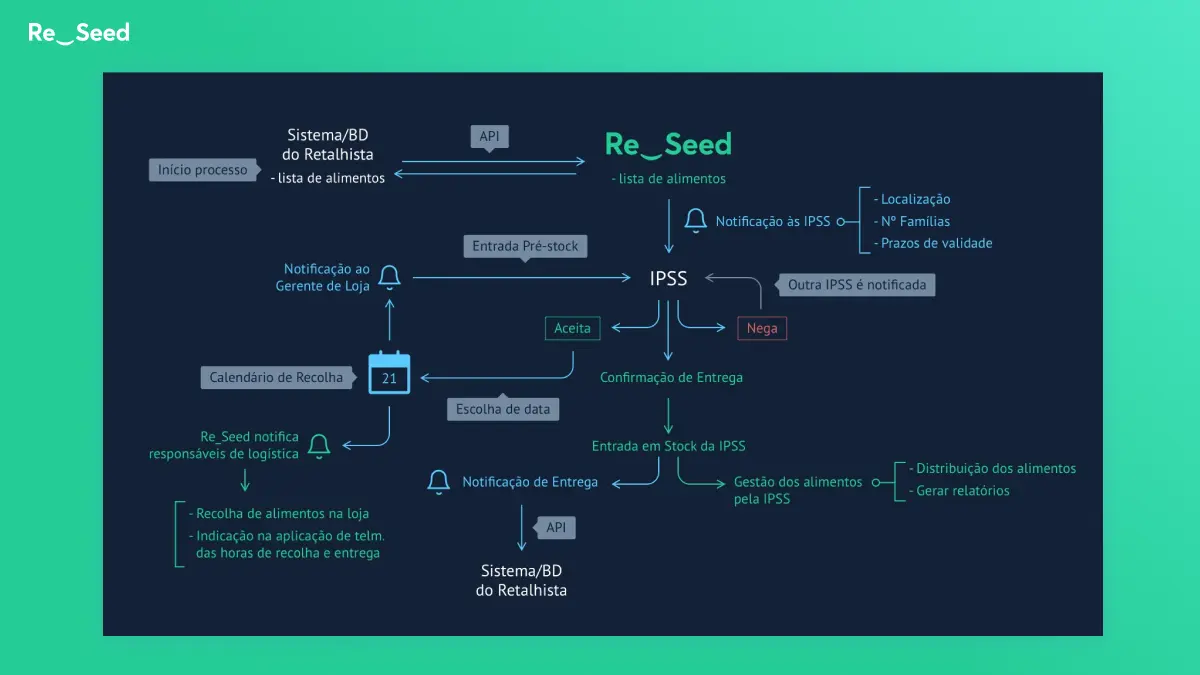
The first step was to develop wireframes for the main pages, so we knew the components we had to design and be mindful of the User Experience during this process. This step was developed in close collaboration with the product managers that had the overview of how the user should interact with the platform and what the main features and flows of the different pages should have.
The results of the service design activities were very important during this phase. Afterwards, our design team started mocking up the pages of the platform. This was an ongoing process throughout the platform implementation and we would go back to the wireframes every time we felt we needed to change something.
